Landing pages are an essential part of every website and are key to generating leads and providing your visitors with the information they need to continue down their buyers’ journey.
The goal of every landing page is to convert traffic into leads. The rate at which it does that is a key metric to determining whether your marketing activities are effective or not.
According to Unbounce, the average conversion rate for a landing page across industries is 4.02%.
The conversion rate of your landing pages will also vary depending on the industry you are in and the level of commitment the action requires.
That being said, there are landing pages that convert at over 20%, effectively generating 5x more leads than the average.
So what sets those apart from the rest?
Let’s dive in and take a look at a couple of examples.
1. Use design to engage your visitors.
View the full page here.
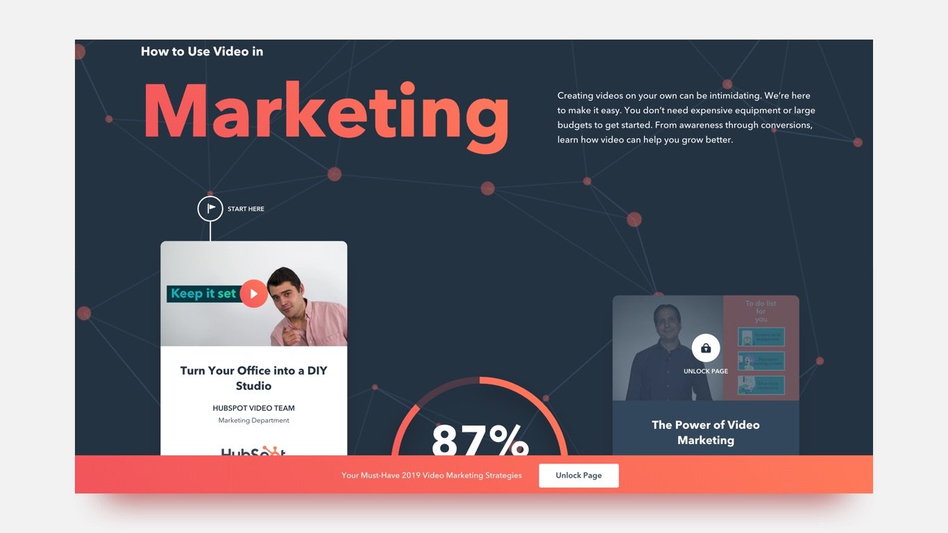
HubSpot leads the way when it comes to producing helpful content and insights into marketing and sales strategies. What’s more, is that they are exceptionally effective at generating leads from their landing pages.
One of their most recent content offers is a gated video series on how to use video in your marketing efforts.
This page does a lot of things right, but what intrigued me the most was the design.
It’s laid out like a journey with a clear start and end point. It takes advantage of the same visual cues that make infographics so popular: visual data representations, contrasting colours, and well-defined space with limited text.
Great design attracts attention which not only has the ability to reduce bounce rates but it increases the likelihood that your visitors will turn into leads.
2. Add a video summary.
View the full page here.
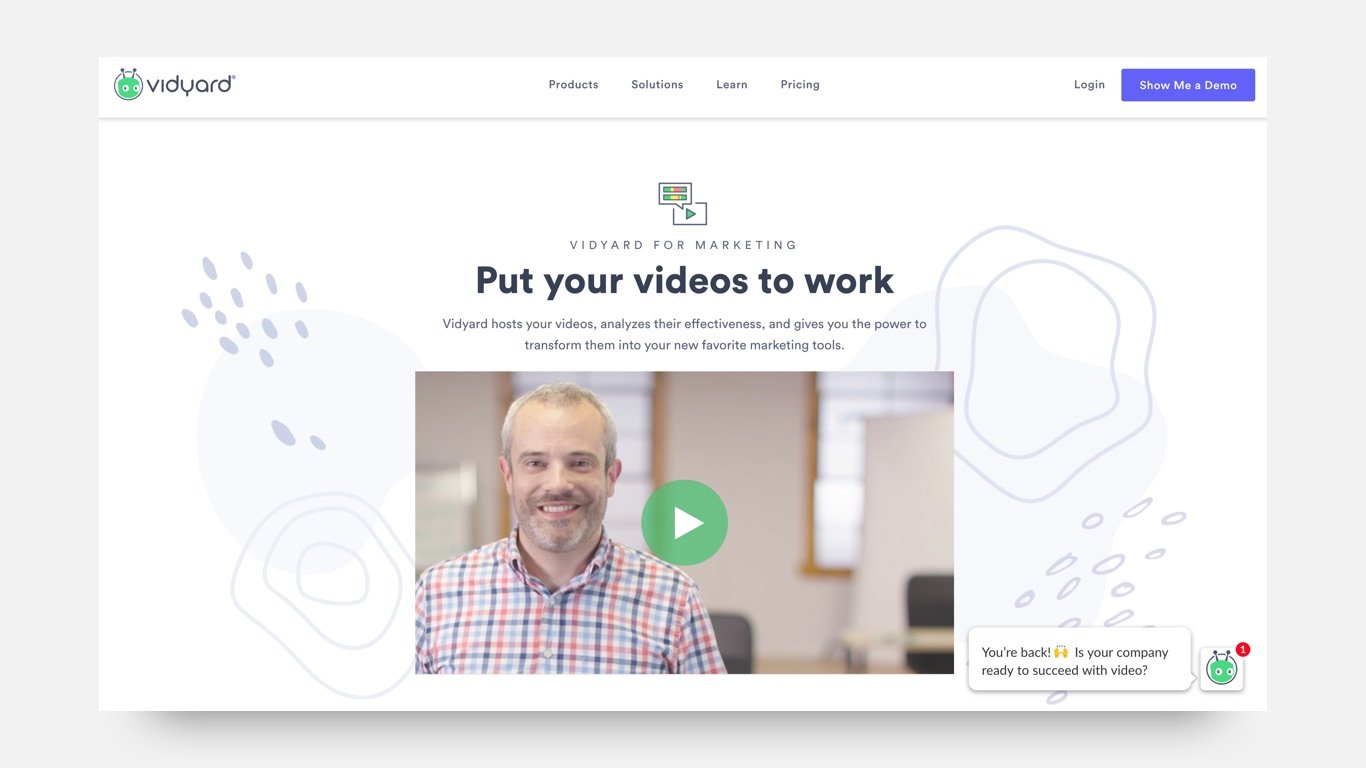
Including a video on your landing page is a proven strategy for increasing your conversion rate.
A recent study found that video can increase landing page conversions by 80%!
That’s a significant result, but not surprising considering that 72% of visitors prefer watching a video to learn about a product or service than reading text.
3. Create descriptive headings and subheadings that clearly outline your value proposition.
View the full page here.
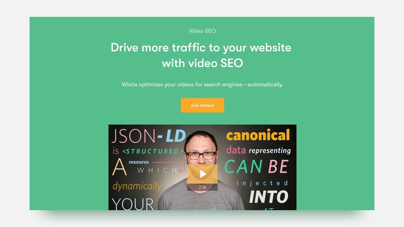
Similar to the product landing page for Vidyard, Wistia also includes a video at the top of their page reiterating the effectiveness of video.
The stand out feature here, is the headline. It’s descriptive and clearly defines the value proposition of their software - generating more organic traffic.
People don’t like to guess and they don’t have the time to figure out what you are giving them, so make it clear and obvious.
Use simple language and get to the point.
4. Reduce friction and the perceived commitment required by your visitors.
View the full page here.
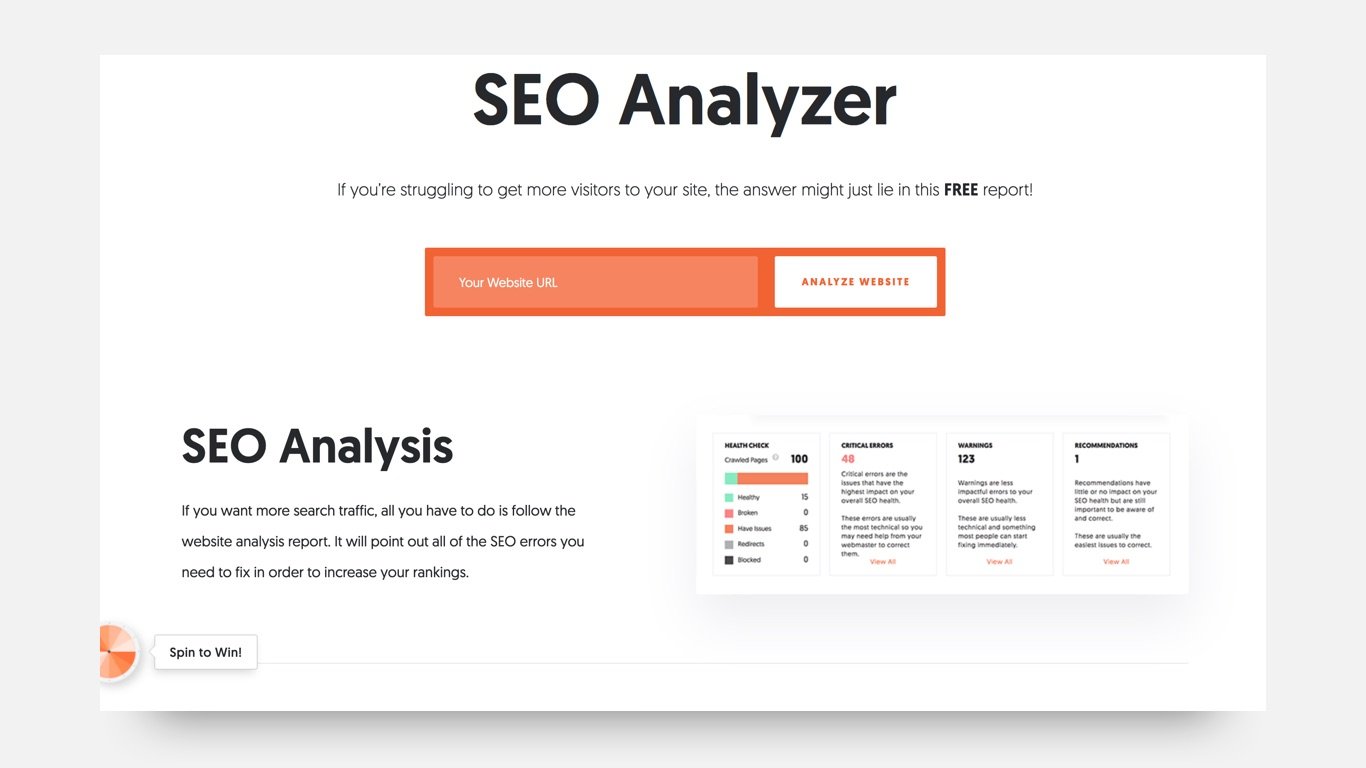
Here we see a slightly different approach. Right at the top of the page is the action they want you to take, submit your URL to get an SEO report.
They highlight the fact that it’s free and only includes one field on the main page, reducing friction and the perceived commitment required by the visitor.
The easier you make it for visitors to get your offer and the less commitment it requires from them, the higher your conversion rate will be.
5. Show them, don’t tell them.
View the full page here.
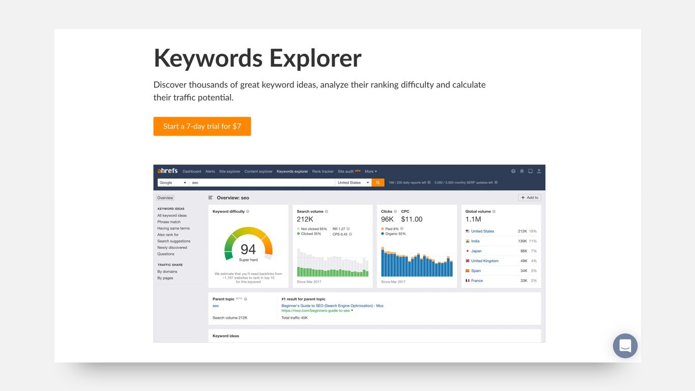
Ahrefs is a popular SEO tool and for good reason. They offer a wide range of valuable insights into your website performance and give you the tools to improve your SEO.
Their tool is their differentiator so instead of writing long paragraphs justifying their premium price tag, they show us exactly what we can expect when we sign up.
This gives us a sneak peek at what’s under the hood and highlights their stand out features.
6. Use social proof to create trust.
View the full page here.
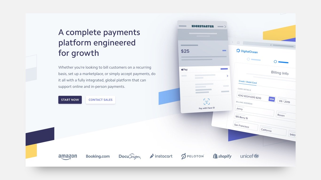
Stripe is a payment solution built on the idea of safety and security. So it should be no surprise that they are familiar with using social proof to create and build trust with their audience.
According to OptinMonster, adding testimonials can improve conversion rates by up to 34%, while over 70% of people trust reviews from people they don’t even know.
7. Keep your page focused.
View the full page here.
Not everyone agrees with this, but...
Some websites remove all navigation, pop-ups, and chat features from their landing pages, while others leave everything as is.
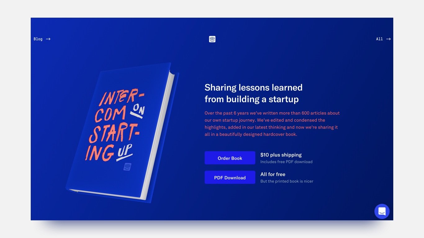
What is more important than removing your chatbot is making sure the page is focused on a single, clear call-to-action.
On this Intercom landing page, you can still find the navigation at the top (although it has been reduced from their full menu) as well as their chatbot on the bottom right but neither distract from the action they want you to take - getting their book.
The call-to-actions are solely focused on that action and it works.
Everything on the page is designed around their book and it’s clear what action you need to take and what you will be getting in return.
8. Let your visitors choose their journey.
View the full page here.
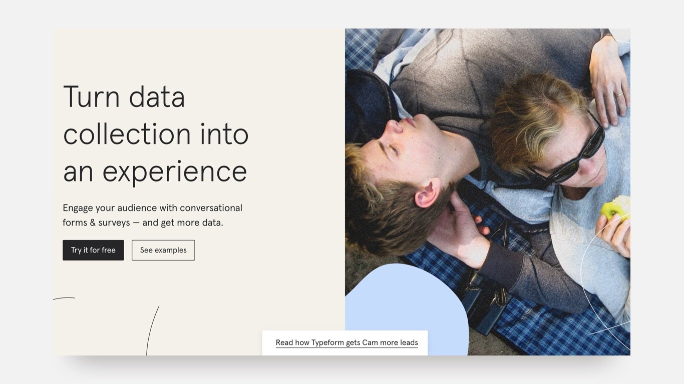
Understanding your visitors is key to getting them to convert into leads. One of the ways to reduce some of the guesswork is to let them choose their own journey.
We don’t all make decisions the same way. Some people need more convincing while others might be ready to commit. To avoid losing leads give them the ability to decide what happens next.
Typeform gives us a clear example of how to do this: if you are already convinced then “Try it for free” or if you need more convincing and reassurance then “See examples”.
This isn’t appropriate for every situation but for product and service land pages that are more generic and higher up on the buyers’ journey, this can be an effective way of segmenting your audience into experiences that are right for them.
Conclusion
Landing pages vary in form and function but their end goal is to drive leads for your sales and marketing teams. Despite their variety of uses there are a couple of standard best practises to keep in mind:
✅ Use clearly defined headings and subheadings,
✅ Provide social proof,
✅ Have a focused call-to-action with enticing copy,
✅ Create a unique design that is easy to navigate,
✅ Use video to outline your value proposition.


.jpg)
