WordPress is the world's most popular CMS with over 27,000,000 live websites globally with roughly 47,000 of those right here in South Africa. That equates to 46% of South Africa websites!
It makes complete sense. WordPress is tried and trusted, extremely versatile and can meet almost any brief, big or small.
So if you are reading this and your site is built on WordPress, well done, pat yourself on the back, no need to continue reading this post…
Just kidding…
Although WordPress offers a lot and ten years ago that would have been enough, it falls short of what you can achieve today.
It's great that your new website looks amazing, is mobile-first and loads at breakneck speed but;
how does it help you understand who your website visitors are?
How do you paint the picture of a buyer's journey from the first visits to the point when they became a customer?
WordPress is great but on its own, but when combined with the right tools it can become significantly more useful in your marketing and sales efforts.
That’s right if the title didn’t give it away I’m talking about HubSpot.
HubSpot is the world's leading marketing automation platform, is used by about 270,000 businesses globally with 1,674 of those websites in South Africa.
In their words, that means CRM, sales and marketing all in one place but in ours, that means streamlined marketing and sales efforts.
So what happens when you combine the world's most popular CMS with the world's most popular marketing automation platform?
That’s what this blog is about. I am going to run through three ways you can give your marketing a boost by integrating HubSpot and WordPress.
We’ll cover:
- Lead capturing with forms and pop-ups
- Boosting engagement with live chat and chatbots
- Using CTA’s to encourage engagement
Before we get started you’ll need to make sure your HubSpot and WordPress accounts are connected so let’s do that first.
How to connect HubSpot and WordPress
There are several ways to connect HubSpot and WordPress. You could manually install the HubSpot tracking code onto your site, or use Google Tag Manager if that is how you manage your external scripts.
Or you could use the HubSpot for WordPress plugin. It is the simplest way to integrate the two and it’s the method I’ll walk you through now.
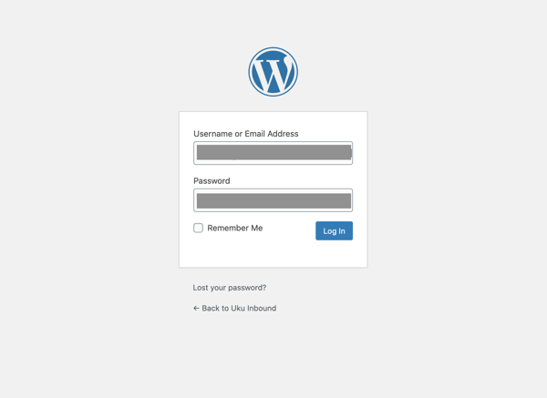
Step 1: Log in to your WordPress website admin dashboard. You can find the login URL by simply adding /wp-admin/ to the end of your site's URL.
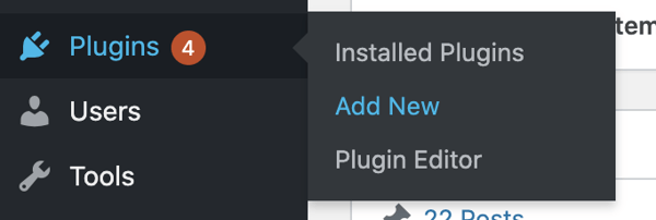
Step 2: In the left sidebar menu, navigate to Plugins > Add New.
Step 3: Search for the HubSpot All-In-One Marketing – Forms, Pop-Ups, Live Chat plugin.
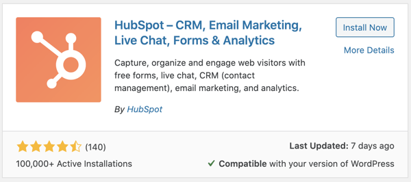
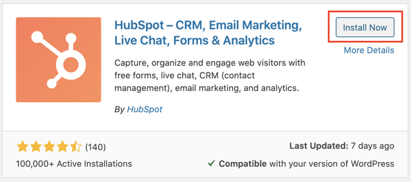
Step 4: In the upper right, click Install Now.
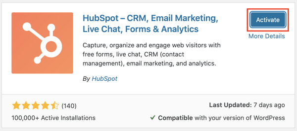
Step 5: Click Activate Plugin.
Step 6: This should happen automatically when you click Activate but if not, in the left sidebar menu, navigate to HubSpot.
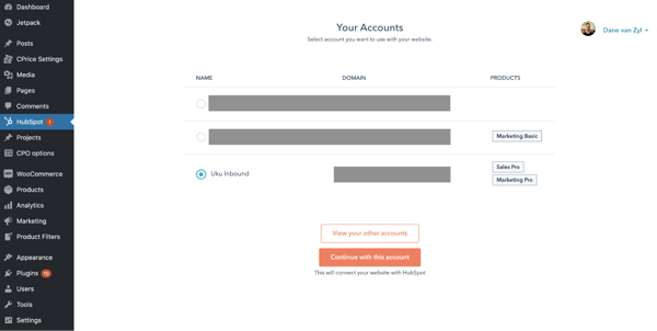
Step 7: Click Log in to your account to finish the installation process. If you haven't set up a HubSpot account yet, you'll be prompted to create one.
If you are still considering if HubSpot is right for you, feel free to connect with us. We’ll help you answer any questions you still have and help you decide if HubSpot is right for you. Book a meeting with us 👉 here.
Now that you are all set up, let’s take a look at what I promised you at the start...
Three easy ways to boost your lead generation coming right up.
1.Better lead capturing with forms and pop-ups
Forms are a critical part of any website and yet I often see them being under-utilised. In many cases, the main conversion point, where you turn visitors into leads, will be a generic contact us.
I have seen instances where businesses have gone the extra mile to create an awesome ebook or research report but then simply leave it on a resource page with a link! So they have no way of knowing who is reading or engaging with their content.
You might be thinking that adding a form will probably stop people from downloading the content. That’s true but I’d say anyone who is unwilling to fill in a form is not serious about solving their problem and therefore not a good fit. If someone is trying to solve a real problem that is meaningful to them then filling in a simple form is a very small price to pay.
That brings me to HubSpot forms. By installing the tracking code HubSpot will automatically start pulling form submission data into the CRM. This is helpful to get started quickly and you can read more about that here.
I, however always recommend replacing existing forms with HubSpot forms for several reasons:
- You can easily create and customise forms in HubSpot.
- They are mobile-responsive so they always look good and are functional regardless of the device.
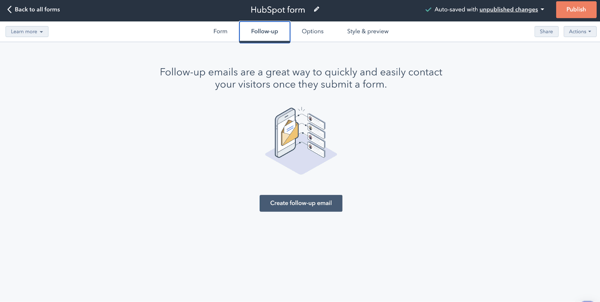
- You can send follow-up emails for specific forms so that the email the user receives is relevant to the conversion action they took.
- Possibly my favourite feature is progressive profiling which allows you to change the questions users see so that they don’t have to keep entering the same information every time they fill in a form. This feature is unfortunately only available for Marketing Pro and Enterprise Hubs.
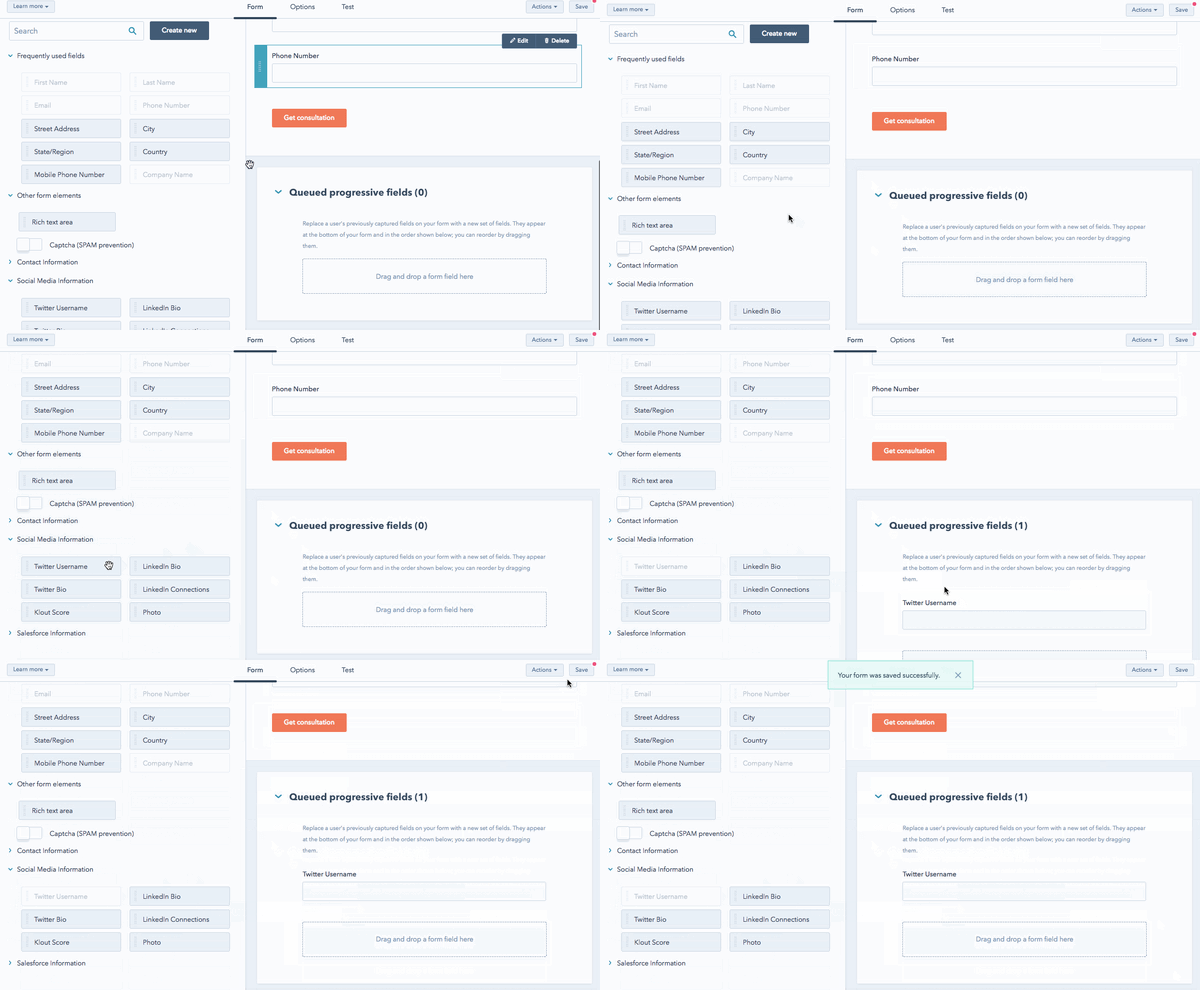
- Lastly, you can create forms in multiple languages which is essential if your customers are from different countries or speak different languages. This feature is unfortunately only available for Marketing Pro and Enterprise Hubs.
Embedding HubSpot forms gives you the flexibility to personalise the user experience for each individual, their specific context and where they are in their buyer’s journey.
Now for pop-ups.
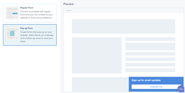
Some people love them, some really really hate them. I err on the side of caution when it comes to pop-ups.
Overuse them, or simply add them to your site without thinking about the user and you’ll quickly annoy your website visitors, resulting in those dreaded high bounce rates and low time-on-page metrics.
Less is certainly more but when done well and in a nuanced way they can add great value to your users and even improve the overall experience.
To get this right you need to think about it like having a conversation. If someone was busy talking to you about organic vegetables would you interrupt them with a fact about pet care? No, you wouldn’t, because that’s not relevant to this specific conversation.
You need to think about pop-ups in the same way. You are effectively interrupting the user, so make it worth their while. Here are a few tips:
- If someone is a first time visitor and reading your latest blog on the health benefits of organic vegetables, then offer them your latest ebook on buying organic vegetables. Don’t waste their time with a generic subscribe prompt.
- If someone is visiting your pricing page, give them a pop-up that could offer them your detailed price list or product catalogue.
- DO NOT have a pop-up appear on every page. Be selective. If you have a specific objective in mind then find a way to make it contextually relevant to the user.
- With HubSpot, you can also ensure that your pop-ups don’t appear on mobile devices. The smaller screens don’t work well with pop-ups.
The more human you make your digital experience the more likely people are to engage with you. It's that simple.
2. Boosting engagement with live chat and chatbots
This leads us nicely to live chat and chatbots. HubSpot groups these two under what they call chatflows.
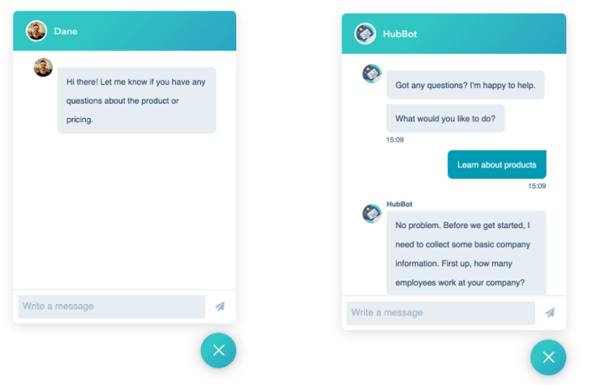 Although live chat has been around since the early 2000s there has been a big resurgence in its popularity. This is partially due to the rise of chatbots but also because of the popularity of instant messaging.
Facebook Messenger and Whatsapp have connected businesses and their customers in real-time conversations, an experience which has predictably manifested itself as live chat.
With HubSpot’s chatflows you can essentially engage with your website users in three ways:
- Live chat only, which is really no different from what you’d expect from live chat human to human interaction.

- Bot + live chat combo is a little more exciting. Essentially the HubBot greets you, asks you a few questions and then hands you off to the relevant team. This is great for larger chat teams or for sending users to the correct department i.e. new leads get sent through to sales while existing customers get sent to the customer support team.

- The bot only option is great for more standard actions or when you are offline. You can automatically schedule appointments or demos or take down contact details for your team to get in touch when they are back online.
 Side note here: There is also advanced, self-help knowledgebase and support functionality that I’ve intentionally left out for another day. We’ll just focus on the marketing stuff for now.
Similar to pop-ups the more thought you give to the context of your chatflow the more successful you’ll be at actually engaging your website visitors. Here are some quick tips for you:
- Tailor your chatflows to specific audiences. For example, if it is a first-time visitor and they have visited 2 or 3 website pages they might be looking for something specific which is a great time for some direct intervention with chat.
- Use the page they are on for added context. If a visitor is on your pricing page and they have never had a demo before then use the HubBot to offer them a personalised demo, alternatively if that user has already had a demo prompt them with a live chat with the sales representative that gave them the demo. Maybe they still have a few questions they need answering.
- Lastly, use sparingly. Don’t bombard users with live chat requests, avoid pop-ups and live chat on the same page and ultimately keep the user top of mind when trying to engage with them. If it’s not how you would do it in a face-to-face interaction then it’s not how you should do it on your website.
3. Using CTAs to encourage engagement
A CTA or call-to-action does exactly what the name suggests. It calls you to take a specific action.
CTAs can be buttons or hyperlinks or images but most importantly, whatever shape a CTA takes it needs to be relevant.
You are probably picking up a theme with me by now. I am a firm believer in making digital engagements more human, more real, and more relevant.
But before we get into how you can make your CTAs more relevant let's first look at some do’s and don’ts regarding CTAs:
|
Do |
Don’t |
|
|
|
Use valuable and actionable copy, such as “Download Now,” “Get Your Free Trial,” “Speak to an Expert,” or “Buy Now.” |
Don’t use vague, cliche or passive language. |
|
|
Place CTAs above and below the fold where they are easily seen. |
Don’t use too many CTAs on the same page. |
|
|
Use CTAs that relate to the content on the existing page, or align with the buyer’s interests and needs. |
Don’t use the same CTA for everyone, include personalisation where possible. |
|
|
Use CTAs in all your blog posts. |
Don’t use branding as the only objective of your CTA, offer something of value to the user. |
|
|
Experiment with placement, type and language to see what resonates with your visitors. |
Don’t link your CTA to the home page. Rather create a landing page that is specific to that CTA. |
Now that you have a few best practices, I want to focus on the space most often neglected.
Your blog.
Your blog is often one of the most overlooked places for smart, contextually relevant CTA placements. Often blog pages are considered lower value pages and then don’t get the attention they deserve.
If your blog is part of your digital strategy, as it should be, then you should place just as much time and attention to figuring out which CTAs make your users tick as you do when it comes to your home page, or any of your product pages.
With HubSpot, you can create CTAs and simply embed them into your blog pages. Typically in a blog post, I would add two or three CTAs in different formats.
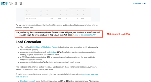
Add the first CTA at the end of the introduction. I typically recommend using a text CTA so that it isn’t too jarring for the reader. There is also a lot of evidence to show that we are so used to seeing image ads that most of us now automatically ignore them.
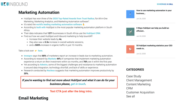
Depending on the length of your blog, I’d add a second text CTA towards the middle.
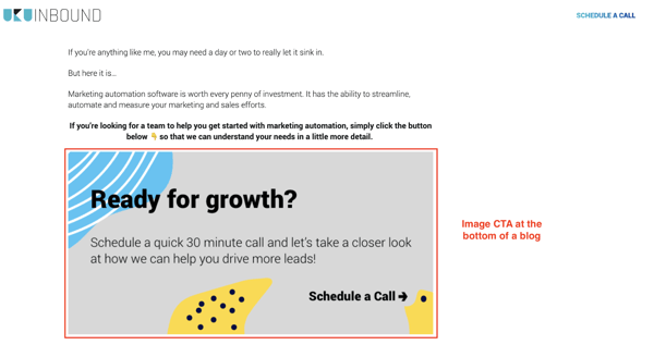
And finally, right at the bottom of the post. We use image CTAs 99% of the time here as a way to finish off the blog with a visual way to promote the next step.
Now, let's get back to what I was saying about relevance. You can make your CTAs more relevant by doing two simple things.
Firstly, you need to make sure that the CTA is relevant to the page it is on. I often see blog posts about one topic with CTAs for content offers about something loosely related or worse completely unrelated to that blog post.
It’s a common problem. But what if you don’t have a content offer that is directly related to the blog?
You create one.
Take your most popular blog on the topic and turn it into a quick guide. You could also repurpose an existing offer so that it is topically relevant.
Get creative here but I think you get my point. The more related the CTA is to the blog post or website page the higher the chances your users will click and convert.
The last way to improve the relevance of your CTAs is to make them dynamic.
With HubSpot, you can choose to display different CTAs to different visitors based on data stored on their HubSpot contact record, or based on information known about their device type, country, referral source, or preferred language.
It sounds technical but it’s actually quick and simple to do. You can check out the detailed instructions here.
A simple example of this is to show a lead who has already downloaded your ebook a CTA for your webinar on that particular topic.
Or if you have a new online course for dog owners and a separate one for cat owners then you can show them separate CTAs depending on their preferences. Assuming, of course, you have taken the time to collect this information:)
That’s a wrap
Integrating your WordPress site with HubSpot is only the first step.
Using the added functionality that HubSpot provides requires a nuanced approach that puts your user at the heart of the problem you are trying to solve.
Now, as for the value of connecting HubSpot to your website, the added functionality doesn’t stop with forms, chatflows and CTA’s. Here’s a quickie on some of the other tools at your disposal:
- You get access to email automation that significantly improves responsiveness and saves you a lot of time.
- Better analytics with reports on everything from website analytics to email and social media, to CTA and form performance. It’s like a whole new world of data.
- And without a doubt, the most useful part of HubSpot which comes free is the CRM. Being able to drill down into individual user journeys is a game-changer.


