Ok, so you’ve spent hours creating your landing page. You’ve double and triple checked your spelling, form, CTA, keywords, made sure the title isn’t too long and you’re sure that it looks pretty damn appealing too.
But, your page is not converting, or at least not attracting the right visitors to your site.
I know this can be incredibly frustrating because you’ve followed the rules and ticked off each best-practice box out there.
So what’s the problem?
You may not be appealing to your target audience. You need to find a way to truly connect with your visitors to keep them coming back for more. We’ve also seen that making minor adjustments to our landing pages can do wonders for your conversion rates.
What’s the deal with landing pages?
Landing pages are a crucial part of the inbound marketing methodology and are the centre of where your leads are generated. Each new marketing campaign that you launch should have a unique landing page where visitors are directed to and convert.
But, did you know that only 48% of marketers build a new landing page for each marketing campaign?
This is an interesting statistic that as companies increase their number of landing pages from 10 to 15 see a 55% increase in leads and companies with more than 40 landing pages get 12 times more leads than those with 5 or less.
Now that’s something to think about!
One of the challenges is that many businesses’ marketing departments don’t know how to set them up. Fortunately, there are tons of tools out there to help you create awesome looking landing pages like Mailchimp, HubSpot, and Unbounce. The great thing is that no coding or experience is necessary, it’s basically drag and drop and super easy to use.
In this blog post, I’ll walk you through some tips and tricks which will not only help your landing pages to look good but will boost your conversion rates too.
1. Keep your headline short and sweet.
It’s true when they say that a headline can make or break your landing page. It doesn’t matter if the actual page content is amazing, your target audience will either decide to keep reading or bounce right off your page, and this decision is primarily based on your headline.
So what can you do?
Make sure that your headline isn’t wordy and is appealing right off the bat.
You can start doing this by making sure that your headline isn’t too long. Long headlines almost always look messy and lose readers' interest quickly. Less verbal clutter is what you want.
Try making a connection with your audience by tapping into their emotions and making it personal. Let’s look at Litmus as an example:
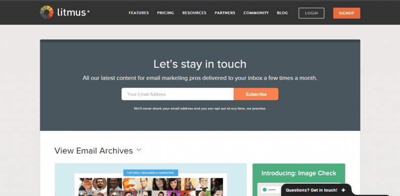
‘Let’s stay in touch’ is as personal and human as they come. The call to action is right at the top of the page, and the subheading clearly indicates the value of taking action and you’re only required to enter your email address which is very little buy-in. The leads are guaranteed to come streaming in.
On top of keeping it short and to the point, try to use different headline styles such as a cliffhanger, ask a question, add some statistics, hacks and how-to’s and always indicate the value proposition.
You may be interested in Email Marketing: 5 Tips For Writing a Killer Email Subject Line.
2. Get to the point
In a world where time spent on social media is getting longer, and attention spans shorter, landing pages with too much information are a no go. People generally don’t read through an entire page of information anymore but rather scan through it to pick up bits of information about the offer.
So you need to make sure your page is ‘scannable’ and your copy clear and concise.
This is where formatting comes in; always include bullet points, bolding, headings, subheading, italics and lots of white space to make your page easier to read. Most importantly, the value proposition needs to be emphasised throughout by addressing their problems and explaining how you are going to solve them.
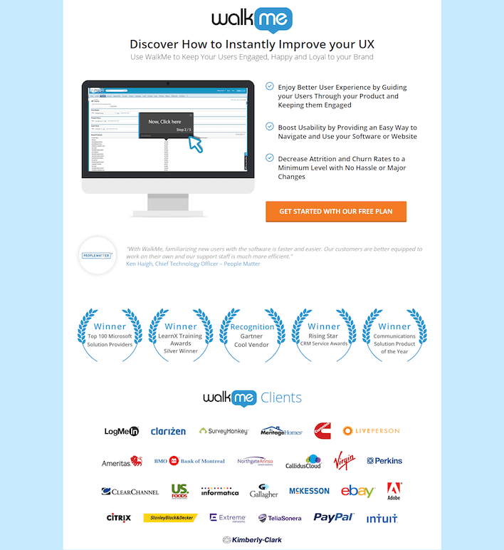
Remember to keep it simple. I like this example from Walkme:
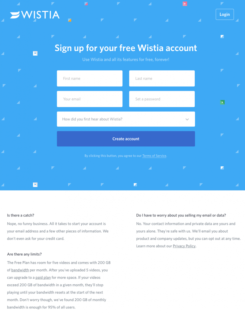
3. The form: ask only the essentials
Did you know that the average number of form fields is 11 but by reducing the number of form fields from 11 to 4 can lead to a 120% increase in conversions?
A published article by Forbes states that the more information you ask for on your form, the less likely your target audience is going to convert fully.
You need to make sure you’re only asking for vital information such as a name and email address, and your conversion process needs to be easy to understand and simple to execute. If you’re asking for too much, there is a big chance that your reader won’t complete the form. You don’t want to scare them off.
As your leads convert and move down your marketing funnel, then only do you begin to ask for additional information.
Here is an excellent example by Wistia:
4. Create the perfect CTA
Your call-to-action is one of the most important aspects of your landing page. It visually guides the reader down your marketing funnel and prompts them to take action by filling out a form in exchange for an offer such as an eBook, Checklist, Newsletter or Case Study, etc. Without them, we would not be able to send readers further down the conversion path or capture any leads.
One of the first things that people get wrong with CTAs is the text.
- Join now.
- Get now.
- Download here.
- Request now!
- Submit.
These are yawn-worthy, right?
Try to break away from text that is too generic and indicate the specific benefit your reader will receive by summing it up in a few words for your CTA.
The benefit needs to be communicated clearly and try to humanise your CTA for example ‘join our family’, ‘start your adventure’, ‘let’s chat’.
Make sure that your CTA button stands out by using contrasting colours to your website and make sure your CTA is always at the right place at the right time. The location of your CTA will depend on what you’re offering.
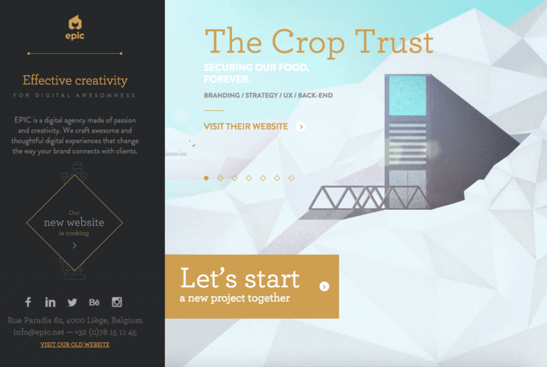
This CTA by EPIC is pretty well, epic:
You may be interested in our blog on Content Marketing Tools Your Digital Agency Need Today.
5. Always A/B test
It’s important to realise that creating a landing page isn’t a one-size fit all approach. What works for one campaign may not work for another.
It’s surprising that only 52% of companies and agencies that use landing pages also test them to find ways to improve conversions. Some marketing software like HubSpot allows you to do A/B tests within the landing page tool which is very convenient.
Remember when doing an A/B test only to make one change at a time. For example, you may want to start off by testing just the colour of the CTA button. One may be green, and one is red, the one with the highest conversion rate wins. From there you can test the layout of your form and so on. It’s important to keep testing different versions of your landing page to avoid missing out on essential leads.
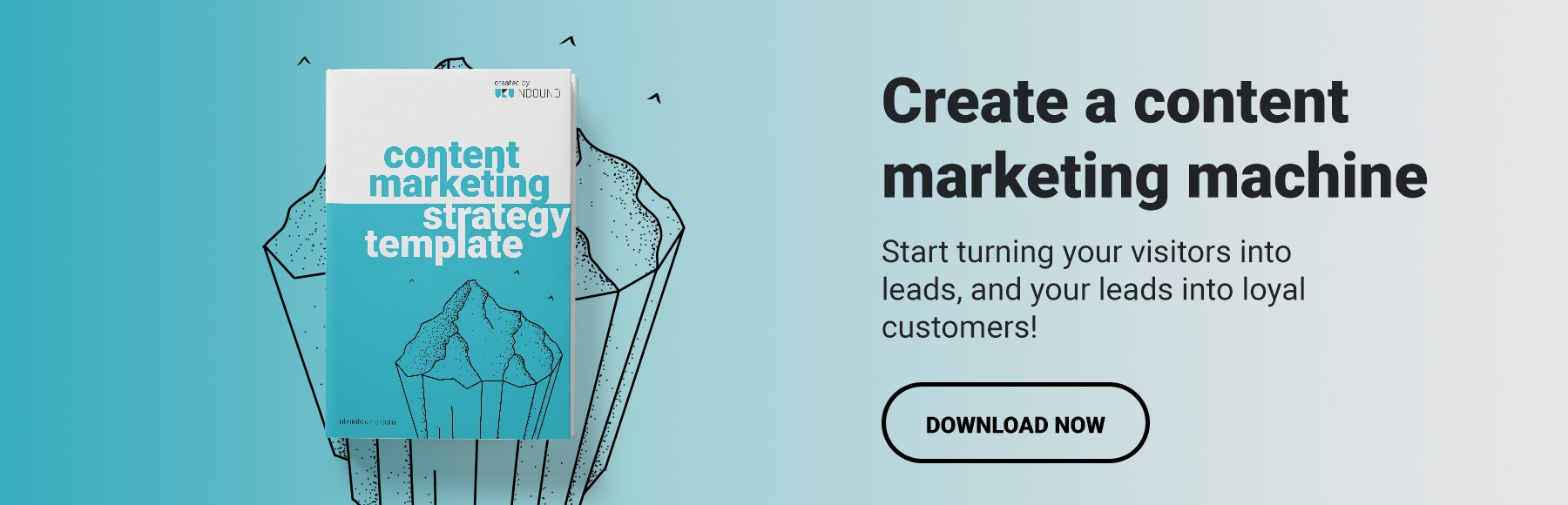
In the meantime, check out our Content Marketing Strategy Template 👇🏼It’s awesome.