If you’re looking for some inspiration for your next FB lead generation ad, look no further.
We’ve scoured the platform for some prime creative and technical examples that will get your creative juices flowing and help your next campaign cut through the noise.
With over 1.9 billion daily active users it is no secret that the pull and reach of Facebook is huge.
In fact, it is the largest social media platform in the world - and still growing.

Add to this:
- 71% of FB users have a college-level education,
- 61% of users earn more than $75 000 annually and
- the average time spent on the platform per day per user is 33 minutes,
and you can clearly see why a FB presence – and advertising – is crucial for a business.
Plus, a recent HootSuite study found that the average FB user clicks on 8 ads per month - that’s 8 opportunities to sell your service or product with a consumer that is directly engaging with your business.
The captive audience FB offers is simply unbeatable. With 78% of American consumers claiming to have discovered a product they bought on Facebook.
Recently, however, the year-on-year new user growth has declined with more complex algorithms and low organic reach frustrating users and advertisers alike.

There are, of course, a number of reasons why businesses choose to still advertise on the platform, apart from sheer size and economies of scale. These include:
- Facebook allows businesses to micro-target specific audiences.
- It offers the single highest retail return on ad spend (ROAS) for e-commerce on any social platform.
- The platform offers a wide variety of ad types, including video, stories and Messenger ads.
- FB ads are cheap. Clothing and hospitality businesses pay around $0.40 to $0.70 per click (CPC), with an average CPC coming in at $1.86. Plus, most companies say that their FB ads provide the best ROI, ahead of Google Paid Search and Instagram.
- FB offers A/B ad testing tools.
What’s more, Facebook offers a variety of ad options for businesses to choose from:
- Post-engagement ads: Use these to drive engagement on individual posts and expand reach.
- Instant experience ads: Primarily used to drive app installs, these ads highlight the core functionality and features of an app.
- Video ads: Video ads are extremely popular and mainly feature videos highlighting and/or explaining a product or service or testimonials.
- Event Response ads: Similar to brand-awareness ads, these ads are more location-specific and are used to promote specific events in an area, such as a store opening.
- Offer ads: These ads include a discount, deal or other content-specific offers and usually feature a CTA specific to the offer.
- Lead-gen ads: Unlike traditional lead-gen ads, FB’s lead-gen ads do not require the user to leave FB for the company advertising to collect information from them.
- Page Like ads: These ads are used to grow organic reach.
- Slideshow ads: Similar to carousel ads or video ads, slideshow ads allow the user to create quick-moving motion ads using static imagery.
- Carousel ads: These motion ads allow the creator to load multiple images and/or images (between 2 to 10).
- Collection ads: These are great for showcasing a large number of products. Collection ads consist of a primary image and four secondary images. Users can scroll through these and purchase the featured products without leaving the platform.
- Image ads: These “standard” ads consist of a static image and typography. They are quick and easy to produce and can deliver big results.
That’s the “what” and “why” parts covered, so let’s jump onto the “how” with 5 smart, results-driven FB ads to get you started or inspire your next Facebook lead generation ad campaign.
5 Facebook Lead Generation Ad Examples That Inspire
1. Porsche Type 7 Ad
Porsche’s Type 7 ad is the perfect example of fun creative, smart copy and eye-catching use of colour and design elements.
A little left of field for a car manufacturer synonymous with style and sophistication, the colourful ad immediately draws attention, forcing the viewer to take a second look, drawing them in deeper.

A prime example of how to use static visual imagery for a winning result, the ad promotes the launch of the brand’s Instagram magazine, Type 7 (@type7), with a simple and straightforward, yet highly effective CTA at the bottom.
To date, the niche daily lifestyle magazine, which fuses visual Insta elements with blog content, has over 356 000 followers.
2. Snickers Chill Video Ads
The much-loved candy bar company launched a series of Chill video ads to promote their Snickers ice cream bars.
The result?
Clever, funny videos that get viewers to do exactly what they are asked to do – relax.
The copy and imagery are on-point. The scenarios are relatable and the ads use humour to great effect – all in all, it is a great example of what video advertising should be and a great way to build brand and product awareness.
Created by BBDO New York, the ads ran on YouTube, Verizon, Facebook and Snapchat and had weather-based triggers. These triggers activated the ads whenever the temperature rose above a certain degree Celsius in specific locations or markets. Talk about brilliant!
3. Blinkist Ad
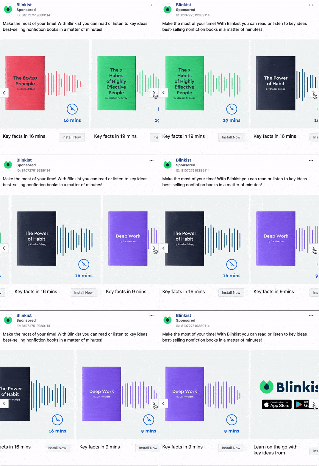
Blinkist’s FB carousel ad is not only a great visual representation of what the company offers – key summaries of 15 minutes or less of over 300 000 books – but a great example of utilising a specific medium to your brand’s advantage by syncing it with your service or product offering.
The carousel ad literally moves from book to book in a few seconds, visually illustrating how customers of Blinkist can also quickly move from one book to the next with their written or audio summaries. How clever!
FB carousel ads have become increasingly popular since their introduction in 2015. One of the main advantages of carousel ads is that it allows you to show between 2 to 10 images or videos in a single ad, each with its own link to your website or product, making it especially great for advertising multiple products and directing customers to product-specific pages .
4. McDonald’s Earn Free McDonald’s Ad
Utilising 3D typography, bold colours and custom illustration work, this simple campaign by fast-food giant McDonald’s really got customers excited.

Combining an instant experience ad and an offer ad, the campaign asked customers to download the My M Rewards app to earn free food. It is simple and highly effective, especially in our 21st-century trade economy where customers are always wondering what they are getting in return for liking, sharing or following a brand.
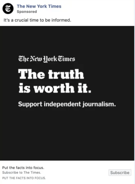
5. The New York Times The Truth is Worth it Ad
This ad by The New York Times is a prime example of how a typography-only ad can make a huge impression.

By choosing stark monochromatic colours and driving their message home with hard-hitting, to-the-point copy the ad reflects the best of journalism: delivering a direct message honestly and succinctly, whilst providing crucial information to the reader.
It is a great example of how different typography and text sizes can be utilised to create an impactful ad.
Key Takeaway
Facebook is a major player in the advertising and marketing arena.
The platform has tremendous reach, and smart brands are working hard to capitalise on this through innovative, thought-provoking, funny, bold and exciting ad campaigns that inspire and delight customers around the globe.
Here’s to you doing the same!


